Yesterday, I went to The Fowler Museum to the see Nick Cave’s “Meet me at the Center of the Earth” and it was wonderful. The layout of the exhibit was innovative and it was a nice change. Instead of the traditional white gallery walls, they used scrim (a semi opaque meshed fabric) to divide the space and direct the viewer. My favorite viewing experience was a small wall with a window where a sound suit looked out into the gallery. It was a playful and thoughtful reference to the sense of wonder and curiosity these suits evoke.
As a theater guy – I loved it. I am very interested in how a viewer can empower an object. Once a person puts on one of these suits, they become one with it, and a new identity is formed, like when a shaman puts on a mask. What’s so great about the show at The Fowler is that they have actual shaman costumes and masks next door in order to give a context to Cave’s work. It’s great to see an artist whose work is focused on our connection to the world around us. I feel that Cave’s work is in tune with Joseph Campbell’s, “The Power of Myth”. Campbell wrote that the job of myth is to put us in context with the greater world around us. I feel these sound suits are a way of understanding that. The mystical is something that my generation lacks, and so when an artist is speaking about this and not some shallow apathetic attempt at being clever, it is so refreshing. So, put some good old magic and wonder back into your art life and check it out… oh and have fun.
This past Sunday I saw The Wooster Group’s performance of “North Atlantic” at REDCAT, designed by Jim Clayburgh, directed by Elizabeth LeCompte, and written by James Strahs. The play was as if somebody took clips and snapshots of the 1960’s America and layered edited them into a single army reel. Seeing the group before, I knew to let my mind go into a sorta soft focus and try to see the big frames of the story. The New York Times writer, Ben Brantley, wrote a general review of the play if are looking for that. My focus was on the Design.
The stage design, by Jim Clayburgh, consisted of a severely raked elevated stage with tables topped with spinning spools of recorded tape and rolling chairs elevated about six feet off the ground. At times, the stage would go almost completely vertical and the girls who operated that recording machines would repel down. Every mechanical element of the stage was exposed and highlighted to convey the militaristic machine that the play was occurring in. There were no literal depictions of setting and with just a few simple blocking changes, the set would completely change. In one scene, the crew went out to a bar, and in order to make this transition, the soldier simply put on a red wig and grabbed a tray while the rest of the crew went onto the upper platform and the cast leaned on the tables thereby giving the allusion that they were at a bar and we were looking down on them – watching and recording their actions. This was great moment because these girls would record the action from above the whole play, and now we became the watchers/observers.
The structure of the play was based on action and reaction more so then a linear plot line, and the stage reflected that. Every element in the stage was either active or facilitated an action. There was nothing extraneous about the set, its form was in line with its function. What also worked well was that the technology that was used was in time with its period. The sound design and editing was excellent. I felt within the frame of the portal, everything relating to the stage was well thought-out, and kept at a minimum. With such a fast moving work that can go anywhere at anytime. There is no time for a scene change, or space for something to be there just for decoration sake. Modern theater has shown us that there are no overall rules when approaching a work, and that I need to shift my approach when facing different forms of the text. There is no more one size fits all. I’m excited to see what’s ahead.
One strange part of the day happened when I heard people downstairs talking about a “Dinosaur Maze” going on upstairs. I was really intrigued because there was no mention of any of that in the programs. I found the escalators, but oddly they were turned off. So I walked up to the fifth floor. When I finally got up there, I was impressed. There were a lot of people and it was a very different feel. Downstairs felt very subdued and rigid while upstairs was a lot more alive and laid back. But upstairs had its own problems. Even though upstairs had some galleries full youthful energy, that was very appealing at standing out, I felt a lot of it lacked any deep meaning.
I asked around about why the work upstairs was not mentioned in the program, and the common answer I heard was that because the upstairs did not have to pay the promoter for the fair, the people downstairs wanted to exclude them. It seems that if you wanted to be part of the fair- officially- you had to pay to the organization to advertise your gallery and you were given a space on the lower floor. If you did not, you were moved to the upper floor even if you are regularly on the lower one. This was just for the extent of the fair. Finding this out made me feel even sadder and more naive and annoyed then I already was feeling. I had no idea what a business the art world is, and how cut throat it can be.
Here are some of my favorites from upstairs:
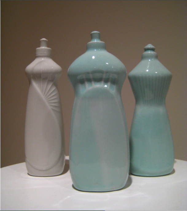
Carolyn Mason’s sculpture ,“Porcelain Bottles”, was one of the few works I saw that spoke about feelings of identity from a female perspective. Throughout the day, a lot of artists dealt with identity issues, but no matter if they were Gay or Straight it was all mostly from a male perspective, so it was nice to see what some women have to say about it. The shape of these bottles resembles a female, but at the same time a domestic object, a soap bottle. The material adds a sense of preciousness and fragility.
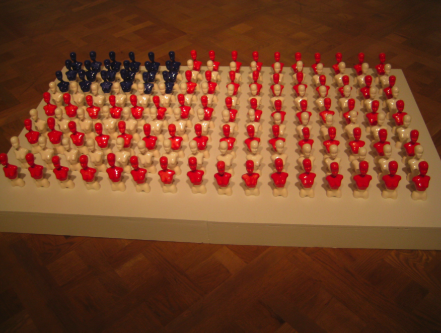
This is a sculpture done by Sharlynora Wilkinson called, “Barbie Project”. I really like this if you see it from the ground. These neat rows of barbie busts, give a militaristic feeling. And to immortalize barbie in the shape of a bust asks questions the ideal American woman.
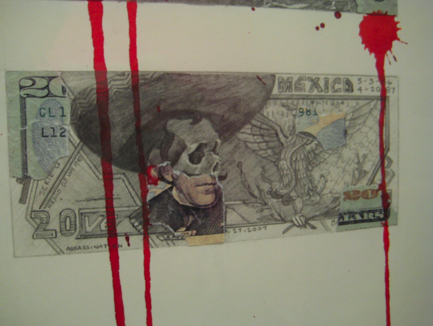
One of my favorite artists of the day was Javier Carillo and his money project. Javier was actually the only artist who was at the Art Fair speaking to people about his work. He said that this whole project started when he found a ripped bill in his studio. He said that he wanted to discuss people he learned about while going to school in Mexico, and to mention what is happening politically along with the violence surrounding the drug wars. I found his ability to discuss many deep issues with simple mediums was a treat to the viewer. I am excited to see how he develops over time.
At the end of the weekend I realized how much I did not know about the certain sides of the art world. The side that wants to be current, cool, and wealthy and for the most part will agree to anything as long as it provides those things. I was glad to see, however, that their were some galleries that were generally interested in the artists work, and not the popularity that it brings. I have a lot to learn, but I am also realizing that there are a lot of aspects of this community I want nothing to do with.
(The following is Part One of a Two-Part series about the Los Angeles Art fair- including intro/background from our friendly new “critic” Vincent.)
After I graduated from college I went to Russia to work with an experimental theater group called “The Theater of Generations,” in St. Petersburg. When I was not designing at the theater, I was taking drawing classes at the St. Petersburg Academy of Applied Arts, known in Soviet times as the Vera Mukhina Academy.
When I came back to Los Angeles I was completely out of touch with what was happening in contemporary art in LA. So I started checking out websites like Daily Serving and emailing artists that I liked, asking for some kind of interview, or any kind of unpaid internship; no real responses. So I wrote to a fellow alumni, Maureen Weiss who sent me to the Art Fair at the Pacific Design Center.
I was shocked by how much I had to pay. I know that its worth it, but just for a two day ticket and parking it was $44. I know to a lot of the people there, it does not sound likea lot , but for some of us, this is not an easy time to be giving large amounts of money. And to have a fair where a young artist can see the direction of where art is going, and then to exclude them with the price is just…wrong.
When you first walk in, it felt like what I imagined the salons in Paris to be like – wealthy collectors in expensive clothing asking about prices of work. You would think the art community would be somewhat open and equal, but no – there was a VIP room, and the sign was right as you walk in, ironically enough next to a statue of some rich 20th century looking Parisian.
Walking around, it was clear that I was a foreigner. There was definitely some kind of uniform in place, and it was not what I had on (dickies and t shirts). For the most part I was treated very well by the gallery owners and workers, with a few exceptions – people who did not have the time of day for a non-buyer. It all felt very overwhelming, and people were definitely trying to flex their financial and intellectual muscles.
As far as the art I saw, a lot of it was really experimental and eye-catching, but hard to relate to. And if I canʼt have any kind of relationship, how can I pull meaning from it? In an interview with Art 21, Robert Adams says, “I think art is the sworn enemy of nihilism. ” He goes on say, “Sam Johnson, a great hero from the literary world back in the 1700s, said that in life there is much to endure and little to enjoy. To the extent that thatʼs true, life is hard to accept. And I think that the reason people flock to museums now, and did so during the twentieth century, was in large measure because of their hope that art would help reconcile that very difficult truth. My fear is that we in the art world are not consistently and ardently enough addressing that old traditional job of art—to reconcile us to life.”
For the most part, I agree with this statement, and used it as a compass to guide me through the fair. I would like to make it clear that I am not an art critic and I have no training in the critique of art, but here are some things that I liked and why.
Compositionally, I feel the sculpture is a coherent whole and has a great flow, for the eye. What I like most about this, is the slippage the work evokes. It raises questions of, is this what I see, am I connecting the head to the body because of habit? From the back you really get the sense that these are two objects, but because they are in a circle with three oval cut in specific places we automatically think its a face and connect it to a the “body”. What’s great is that its unspecific enough to allow for an individual conversation with the piece. It even maintains its neurotic tone from all sides.
Edgar Cobain- Represented by Gallery Charro Negro
The first image is called, Trinidad. The artist adheres to kind of digital photo realism, a statement of our times. The form is compelling, and I like the symbolic connotations. For example, a masked, dark-skinned person holding a shovel and a hammer, another faceless laborer, but this one feels proud, a Rooster is his face, and the gesture of the pose feels strong. Its reflexive but it does not feel like the usual self pity we expect from expressionism.
Fantasma. Here we see that by cutting holes in the fabric this painting feel much more militant in nature, some kind of Gorilla Soldier uniform, but the fabric is blue with flowers, a subversive touch.
These sculptures were particularly interesting. Each one takes on a specific form, for example dwarfs, alvin the chipmunk, a native american, fists, angels, and a married couple. All of the sculptures bring forth specific memories and feelings, but when they are painted black and red they lose individuality and become bookmarks, almost like labels on a mental file cabinet of our experiences, and since each one of these objects gets the same treatment, it’s interesting to see a heroic bust of a Native American upstaged by Disneyʼs seven dwarfs.
Sage Vaughn
These birds are also found in his Video “Way Down”, that you can find on youtube. “Way Down” uses the fighting of Red Cardinals and Blue Birds to symbolize the fighting between LA gangs, the Crips and Bloods. What I like about this work is that the birds are drawn and painted very well, and he uses a filmic sense of composition. The bird is painted very sharply, while the building behind it is very much out of focus. Since we are such a video based culture, the 2D composition is even more relevant because this is how we view the world through the eye of a camera. This uses the same shot composition that a camera uses. When seeing this bird alone, it does not have the same power as if you have watched the video which I highly recommend doing, it provides a great story that made me highly invested in this work.
Solving History. I like how he’s taken an object from our past and puts nails in it to make it an object of violence but then subverted that by adding colors and butterflies. This makes the work violent yet playful simultaneously, two opposites smashed together, a metaphor.
Antonis Donef’s collage work is made up of torn pages out of books that are then glued back together and drawn upon with intricate detail and skill. The work from a distance seems very mad, but up close it is calm and clear. The drawings are done with pen, and it seems like there is not one smudge or mistake. Based upon our memory, and even though each little bit seems clear, when we step back it’s just little facts and pictures that are not really coherent. It’s like somebody took a person’s memory and shook it up. Just as print seems clear, with its perfect fonts, the drawings reflect the confidence and certainty of the work of the machine behind them.
Tracy Nakayamaʼs work, this one titled “Rising”, really shows the delicate relationship that she has with her brush. I think this painting is beautiful, and because of that I feel it is transcendent and will always be relevant. Out of the whole day I feel this was one of my favorites.
(Stay tuned for part two… more art. more artists. and more insights…)